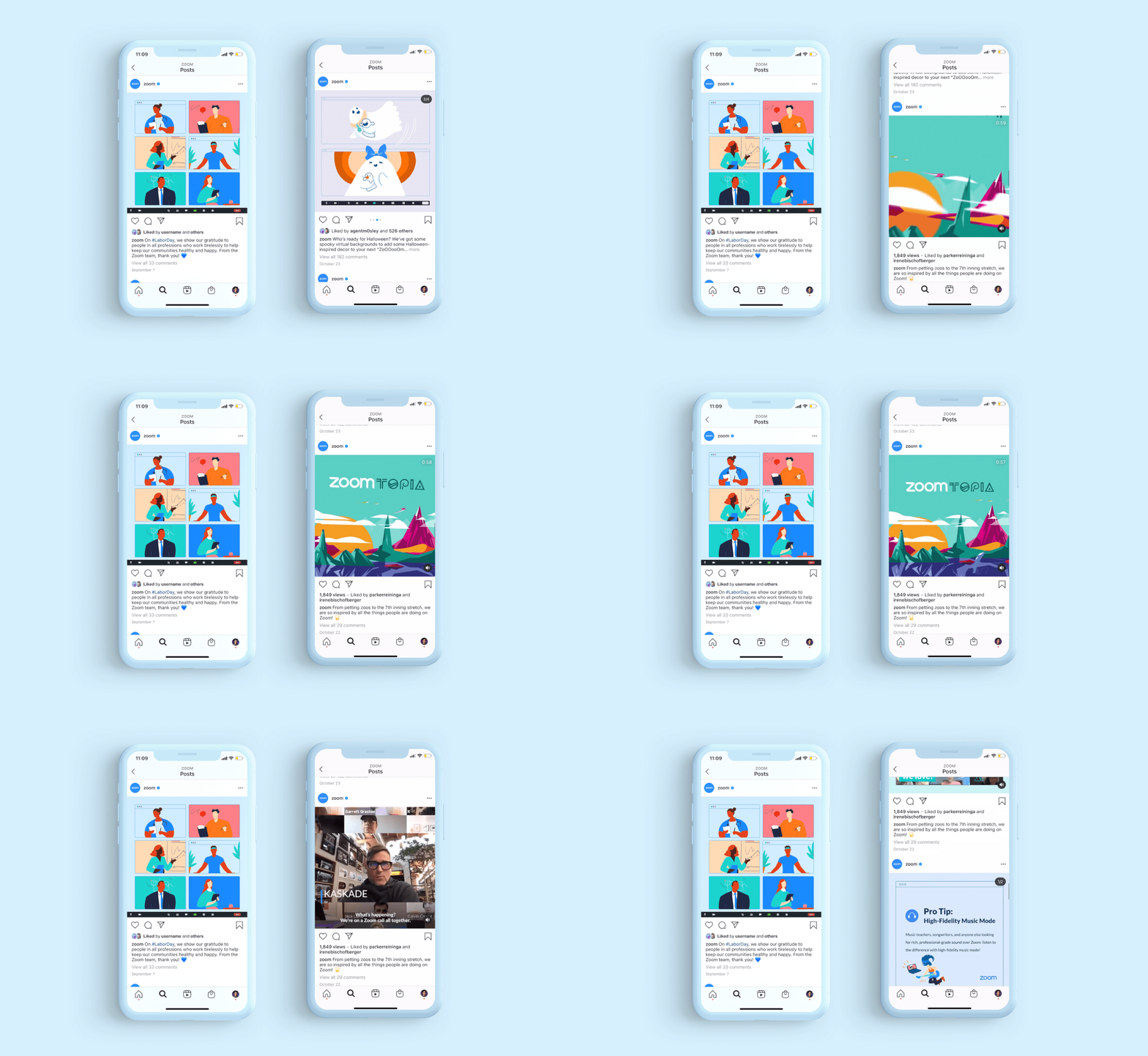
I had the opportunity to redesign the past Social Skins with an illustrative approach, while working as a freelancer at Westbrook Studios. Creative Direction: Michael Bucchino, Lyndsay Aronson, Christie Dishner.
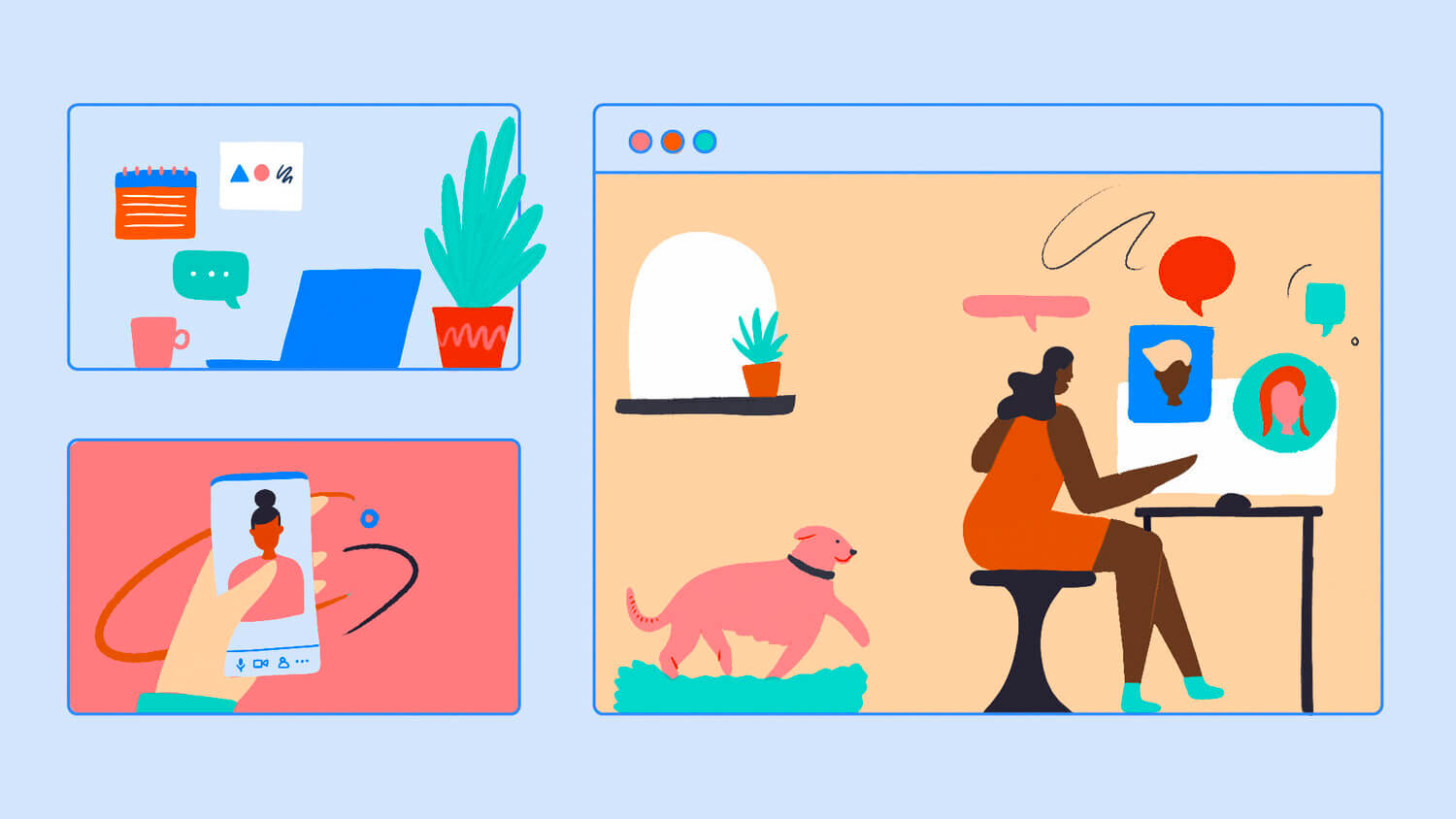
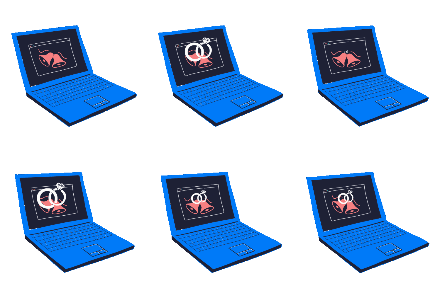
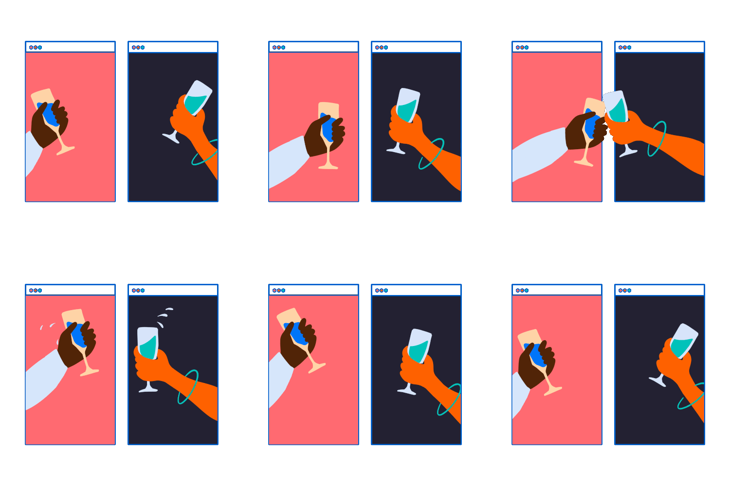
The window concept is inspired by the idea of placing illustrations on multiple types of devices such as a computer browser window, mobile, iPad, and tablet screens within a grid. This grid highlights the purpose of Zoom connecting on a wide variety of devices, layering objects in the background/foreground, giving the idea of “opening a window.”
Zoom is a bridge for people all around the world, therefore the illustrations must capture special moments of people interacting, business events, happy hours, school classes, and endless gatherings. There is an entire world within our browser window. This creative and exciting window concept communicates a moving world where characters and objects appear free but observed. They feel familiar and a little bit playful. It is captured through movement and playing with texture in unexpected ways. The content is placed on a grid that can adapt to any cover art while ensuring a good composition.
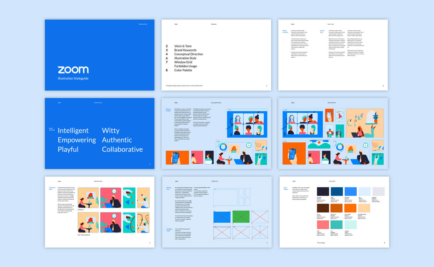
I created a GIPHY sticker package based on the Zoom creative concept. Using different animated typography treatments geared towards how people are talking about using Zoom.
